Lincoln Is a Theater Popcorn Mascot
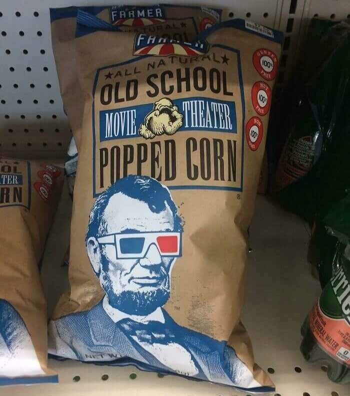
This all-natural popcorn brand claims to be old school, which might be why they chose to have Lincoln as their mascot. Surely, aesthetics were in mind when it came to this design, and the 3D glasses are super cool, but the movie theater popcorn company didn't put two and two together. If you know anything about Lincoln's notorious assassination, then you probably know exactly why this wasn't the best design of choice.
Lincoln's final day of life started in a theater and ended in one after he was assassinated during a show, which means that this company should have probably picked a better mascot!
A Marketing Attempt That Aged Badly
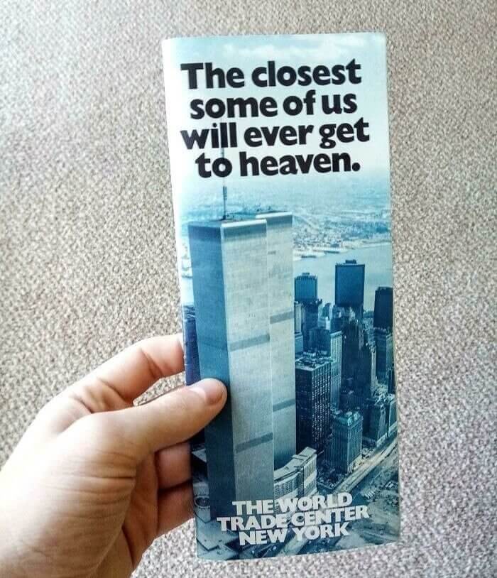
Before any emotions start to flow through you, we should probably start by letting you know that this pamphlet was designed and printed in the 1980s, way before 9/11. Truthfully, there probably isn't a single pamphlet or advertisement out there in the marketing world that has aged as badly as this one, and you can probably understand why. Since this was made in the 80s, it thankfully wasn't much of a design failure until today.
For many Americans, especially from New York, 9/11 is a touchy subject, so there will certainly be quite a few offended people after seeing this- until they realize when this was made.
When One F Art Just Isn't Enough
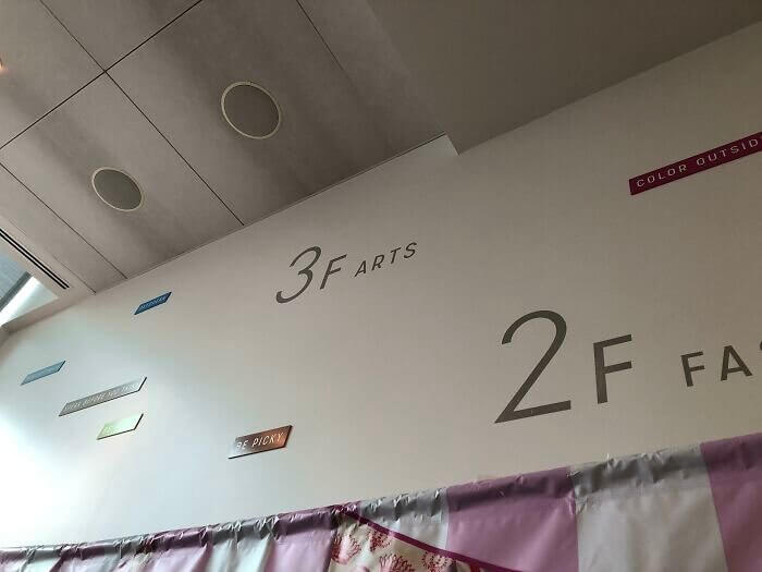
There's no way to know what 3 F Arts actually means, but we're pretty confident that it's a lot less funny than whatever you're thinking. It seems like it has something to do with some kind of art room or section, yet the creativity wasn't exactly thought out as they were sticking these letters onto the wall. Instead, they've accidentally, or maybe purposely, created a pretty hysterical bathroom joke that you simply can't unsee.
Someone didn't think much when they put these letters up on the wall. Let's hope there won't be any kids in this room because they'll never let the joke go.
A Cloud Design That Looks More Like Mold
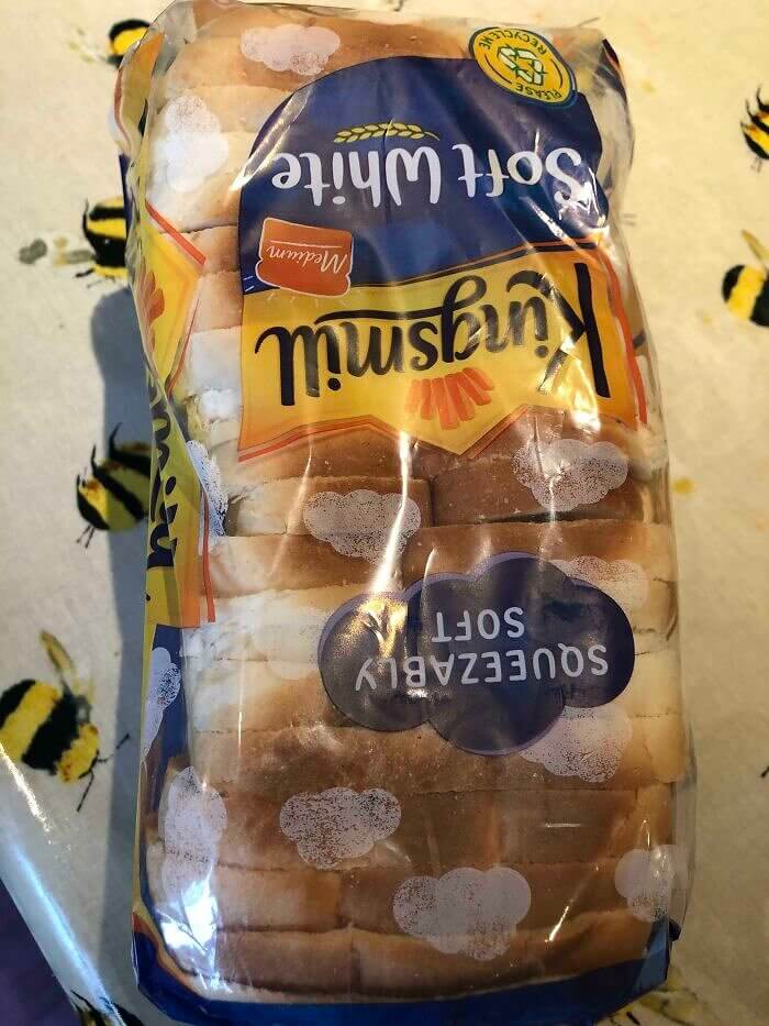
For a second, you might not actually realize that anything is wrong with this bag of bread with an adorable cloud print on it. The issue is that sometimes, bags can gather things like condensation or mold, and the cloud print makes it seem like there are both. After a few seconds of looking at it, this bread bag owner needs to remind themselves that the fluffy design is simply nothing more than that.
Adding a cloud design to this bread bag was a cute idea, especially since they wanted to emphasize their product's softness. On the consumer side, it's just a bit confusing.
This Wheelchair Logo Is Accidently Cynical
Whoever noticed this wheelchair had to take a picture of this moment while at a restaurant. That's because this guy's wheelchair brand is called 'Karma," and it's written on the side of the chair for everyone to see. It could be worse, but the more you think about it, the more you realize that it wasn't the best name for a wheelchair company. Thankfully, they weren't referring to the mind that goes around and comes around.
All jokes aside, if you're disabled or a wheelchair user, the last thing you'd want to read every day on the thing that gets you around would probably be 'karma.'
Pool Architecture Gone Wrong
Someone, somewhere, was designing a pool and failed to realize what it would look like once it was built. Either that or whoever made this thing had someone else on their mind. Whether this was accidental or it was done on purpose, there probably isn't another swimming pool out in the world that looks like this one. That's mostly because this design wouldn't get through the drawing phase before it could have been built.
The only time anyone could really notice something wrong with this design would be from an ariel view, so looking at this from a satellite map is probably purely hysterical.
Surprisingly, This Drink Is Loved in Korea
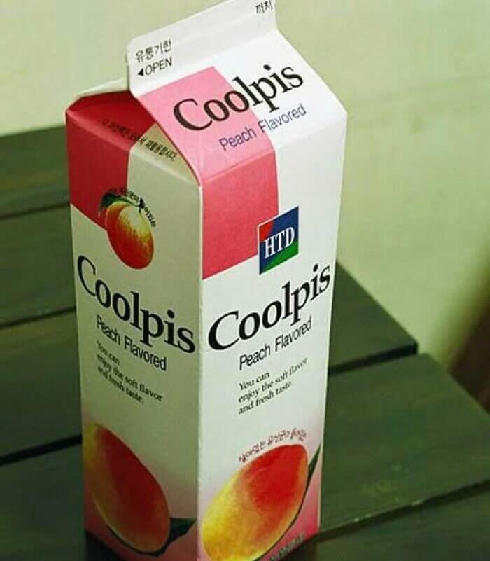
Believe it or not, Coolpis is a Korean brand of juice that might not actually sell well in any English-speaking country for obvious reasons. That's because most people don't really want to think about bathroom activities as they pour themselves a cold drink of peach-flavored juice. Although, if you think you're able to get past the name, there really isn't anything better than a cold cup of fruit juice on a hot day.
Coolpis is exclusively a Korean brand, and even though it's beloved in the country, we're actually wondering whether or not Koreans find this name to be just as funny as others might.
A Building Design That Looks Dangerous
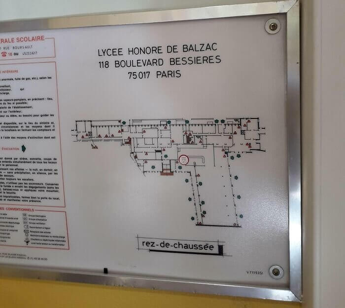
It doesn't seem like the designers of this building were too concerned with how the final product would turn out. That's because the shape of this college dorm looks exactly like s gun. In fact, there isn't anything about it that doesn't look like one. From the barrel to the trigger, it's possible that a weapon was the main source of inspiration when it came to creating this part of the French university.
Guns and universities don't really go well together for very obvious reasons. Although most people probably wouldn't understand the reference unless they took a minute to look at this emergency exit sign.
An Almost Dirty Dachshund Print Promotion
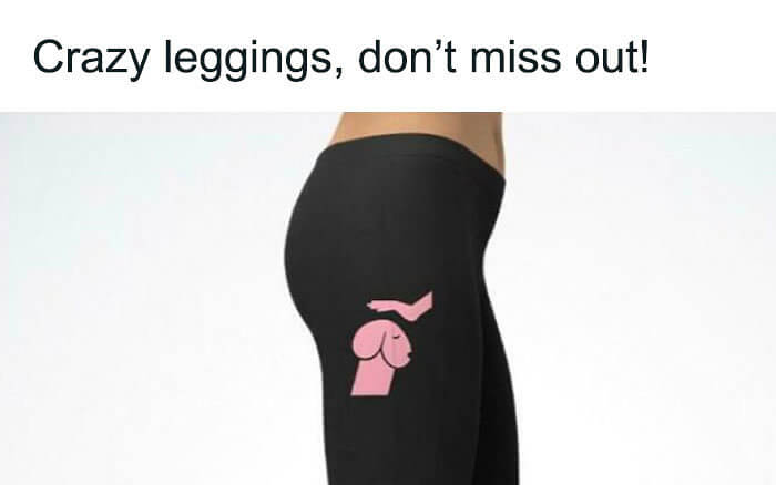
This clothing company should probably rethink the design they put onto these leggings for obvious reasons, and we're pretty sure that most people would agree. It's supposed to be a cute little dachshund dog, and that's only visible after a long and clear explanation. This was part of a promotional advertisement on the internet, and we do wonder how many people were able to figure out what was really printed onto these.
If you're feeling a little guilty about what you think you see here, there's no need to worry because we get it, and everyone else on the internet does too.
This Menu Holder Recommends a Creepy Diet
The restaurant pictured here might be the first one to recommend eating small children as opposed to what they offer from the kitchen. Actually, we're just joking, and if you didn't already know, the labels for these menus just happen to spell out a creepy sentence if you read it from top to bottom. It's possible that whoever took this picture either had a sick mind or simply thought this layout was super funny.
This restaurant doesn't actually recommend eating kids, although most people walking into this place for dinner are probably just a little bit confused as they walk past the menu area.
A 7 Day Rub Rub for Back Foots Only
Unless you happen to have been born with a back foot, you're probably a bit confused. If you do have one, there's no judgment here, but chances are that you don't. This massage place was obviously trying to let everyone know that they do both back and foot rubs while being open seven days a week, but of course, the internet decided to take things to an entirely different yet funny level.
There's nothing better than taking a spelling layout and reading it in any way your heart desires just to make the world's funniest sentence- even if it makes absolutely zero sense.
Seems Like Canada Is Funding Coronavirus
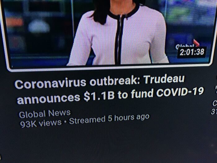
Most journalists work to make their titles short and sweet, which might mean that they don't always make sense all the time. Sometimes, proper punctuation is forgotten, or sentences become too wordy, which allows an audience to turn them into anything they'd like, with the support of the internet, of course. This sentence made it seem like Trudeau himself was about to invest a billion dollars into helping the Coronavirus thrive in Canada.
Of course, Coronavirus was pretty detrimental to every single country, which is why they probably should have pointed out that Canada was funding Coronavirus relief efforts and not the virus itself.
A Birthday Balloon Bust, or Something Like That
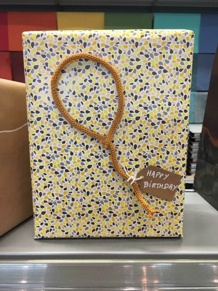
Someone intended to get creative while wrapping this birthday present, but instead, they left the whole world confused and questioning everything about this gift. The thing they made with yarn looks like it could be a variety of different things, but none of the options actually make much sense. We do hope that this was supposed to be a balloon, but the lack of creativity truly just leaves all the other strange options wide open.
Whether it's a balloon, a tennis racket, or a noose, we'll truly never know what the intended message was for whoever decided to put this thing onto a birthday gift.
A Mini Golf Designer With a Sense of Humor
Someone was playing mini golf and had to stop to take a picture because the 15th hole was just way too funny. The illusion kind of disappears after you realize this is only a tiny section of the course, but that doesn't make it any less hysterical. It was so great that the photographer couldn't resist posting it all over the internet, where the reactions were even better than they ever thought was possible.
This miniature golf course might not be appropriate for kids, but that doesn't mean that a comedy-loving adult can't go out and have a good laugh at hole number 15.
This Character Limit Gave a Whole New Meaning
When videos are listed on Youtube, viewers only get to see a certain amount of letters while scrolling through their feed, which could sometimes change the entire sentence's meaning. As you can tell, that's exactly what ended up happening here. Luckily, Gareth Southgate wasn't actually urging young people to get Covid; in fact, it was quite the opposite. This unintentional error could only be realized after clicking on the video, where things start to make more sense.
This video title was supposed to let everyone know that a sports manager was recommending young people to get vaccinated against Covid-19, but due to the character limit, that didn't work out.
The Wrong Way to Love Your Neighbors
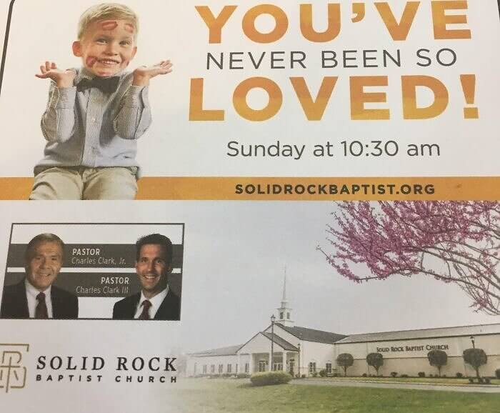
If you know anything about the church, love and children shouldn't really go hand in hand, especially when the givers of that love are two pastors. The intentions of this advertisement were nothing less than good, but not much thinking went into the graphic design section. It would probably be for this baptist church to consider altering its advertising methods just a bit before they continue to spread this one out into the world.
It seems like Pastor Charles Jr. and his son want everyone to know that they're loved, but leaving the child out of the advertisement would have probably been a good idea.
A Book That Abbreviated Pumpkin Pie
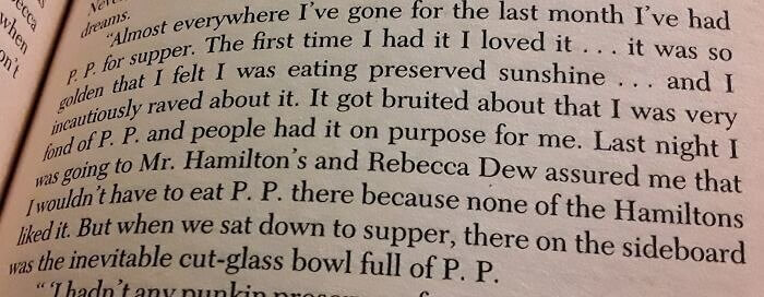
The author of this book chose to use the letters 'P.P' when it came to talking about pumpkin pie, and that seems to have ruined this entire section of the chapter. According to the picture, this character felt that they were eating 'preserved sunshine' and although pumpkin pie can certainly be considered just that- so can other things. Things that we simply won't name because you probably already know what we mean.
Abbreviations are great and can really help a writer cut down on words if it comes to that, but we highly recommend avoiding one that is anything close to P.P.
A Lawn Service's Brand New Name
This lawn service recently changed its name to Coochie, and one of its workers was a bit confused as to why. For twenty years, the original name remained untouched until the day this picture was taken by one of the company's employees. It might not be the best name for a landscaping and mowing company unless you consider this to be excellent advertising, and from that perspective, the choice of name is kind of genius.

This lawn service, also known as Coochie, actually had a much more normal name just a few decades before so we'd love to know the specifics when it came to choosing the new one.
Adidas' Message Turned Into a Very Big Fail
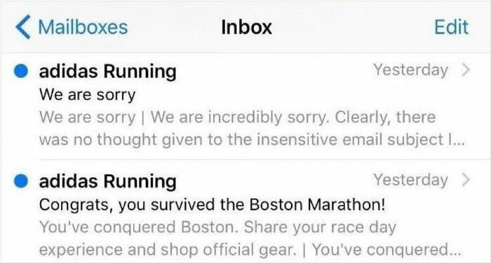
Tragic events aren't really ever laughable, which means that this big mistake made by Adidas was just a plain failure. They sent out a mass email congratulating their customers for "surviving" the Boston Marathon, but in reality, the bombings that took place there were actually super fatal. Thankfully, the company quickly sent out an apology email to make light of their mistake, but it was already too late by that point.
Whoever is in charge of composing and sending mass emails to customers at Adidas clearly wrote and sent these out before realizing that the marathon did in fact turn into a terrorist massacre.
This Card Knew What Was Coming
The graduation card in this picture hints at the fact that a bunch of terrible things are about to happen and it almost seems like a threat. Receiving this card was probably an inspiring thing at first, but the world started to change just a few months later. When Covid kicked in, the world as a whole was bound to their houses for way too long. This card is either a super sweet memory or a bad omen.
From years of lockdowns to a worldwide pandemic and so much more, as soon as the year 2020 rolled in, it seemed like every bit of possible bad did too.
A Strange but Appropriate Brand Name
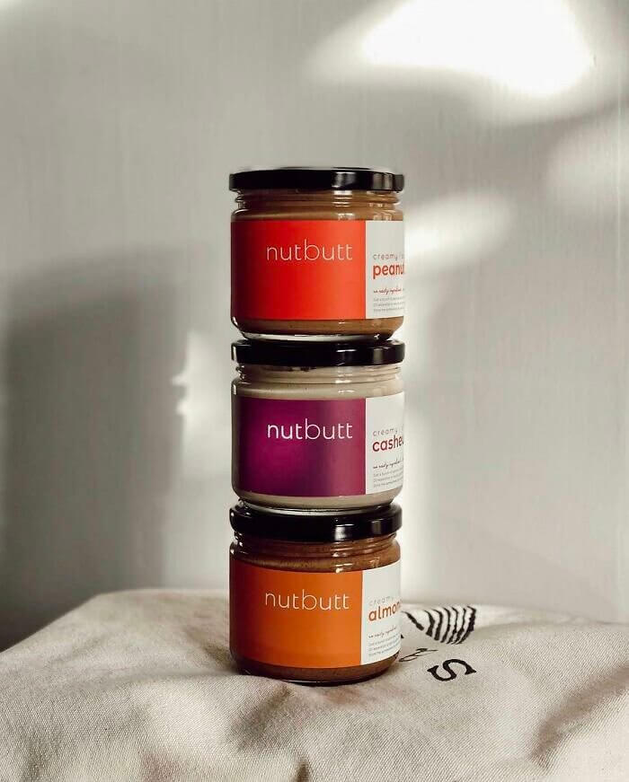
This nut butter company left out a few essential letters in their name branding, which means that they chose to call themselves 'Nutt Butt.' It's actually pretty funny, and although you might be thinking that this wasn't the best name for a company, Nutt Butt might not agree with that statement. The hysterical name might have actually helped them get more sales than if they chose something a bit more boring.
Some would say that this nut butter company didn't spend much time on thoroughly choosing a name, while others might think that they actually thought this one out just fine.
Either a Wardrobe Special or a Bad Joke
The story above the wardrobe special unfortunately relates to the story above it, which could have either been excellent advertising or terrible timing- depending on how you look at it. Since the story is actually incredibly terrifying, we're pretty doubtful that anyone would be inspired to actually buy a wardrobe after reading the above news coverage. Thankfully, it's highly likely that the positioning of these wasn't actually planned out and just kind of happened.
It's probably safe to assume that the wardrobe company reserved this newspaper section for advertising, and lousy luck just happened to make the news story above it way too relevant.
An Ice Cream Flavor Meant for Monsters
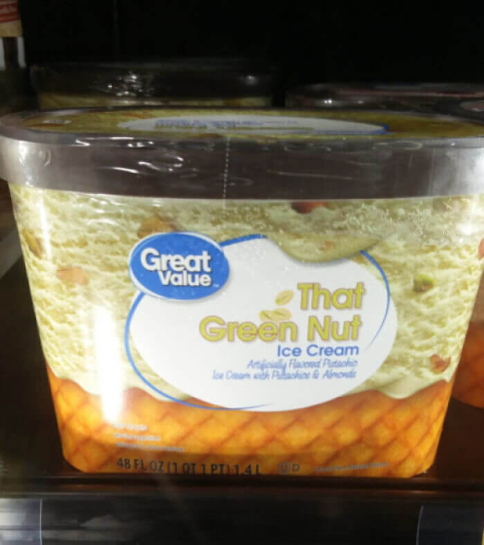
This pistachio ice cream can't have the word 'pistachio' in it for legal reasons, which is why it's called 'That Green Nut', which doesn't sound appetizing. Most people running to the store to buy pistachio-flavored ice cream probably wouldn't pick up this pint or get anywhere near it. The only kind of creatures that would be craving 'That Green Nut' might be the ones you thought were living under your bed.
If you're actually into pistachio ice cream and love nothing more than a bowl full, you might not have any interest in buying a flavor that's called 'That Green Nut.'
A Universal Party Implied Something Different
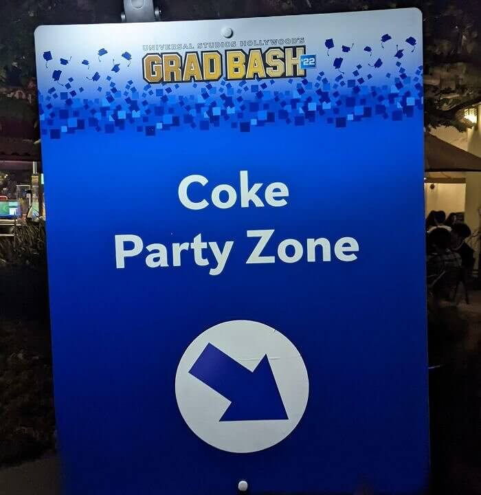
This vague sign was made to direct people to Universal Studios' graduation party even, but they didn't specify what kind of Coke would be the central theme at the bash. This picture allowed the internet world to make a big joke out of the sign, and we kind of understand why. Thankfully, the only sort of Coke sold at the party was the fuzzy drink we all know and love.
Since it is a Hollywood graduation bash party, a few people attending the event may not have thought that soda would be the main item being served to the guests.
This Sign Is Great for Getting More Lost
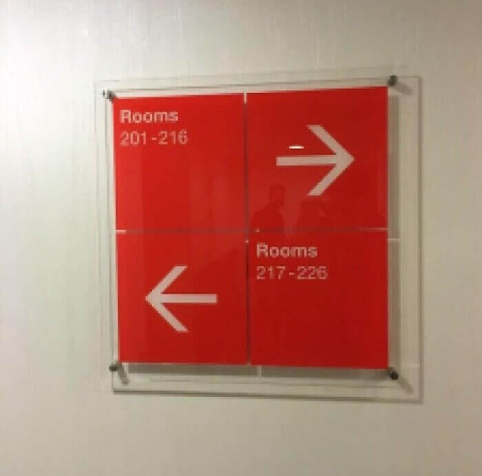
If you're wondering which section of room numbers the arrows are pointing toward, don't worry, everyone else is wondering too. The good part about your perspective is that looking at this picture won't make you lost. People in this building looked at this sign to figure out where they needed to go and ended up being more frustrated than ever. The front desk has surely gotten a ton of navigation complaints.
The building that put up this sign thought that they would be able to quickly help people find their rooms, yet it actually ended up making them even more confused.
An Airline That Appreciates Honesty
Someone was on an airplane that was about to depart when they noticed a really weird message on the screen. It might just be a fragment of the entire sentence, but that doesn't make it any less creepy. Even though it's just a technical error, we would probably look at this as a message from the universe. In this case, it would probably be better to be safe rather than sorry, of course.
A major computer glitch on this airline accidentally created a scary message that no passenger on an airplane would ever like to even consider as they're about to take off.
Spider Man and His Questionable Move
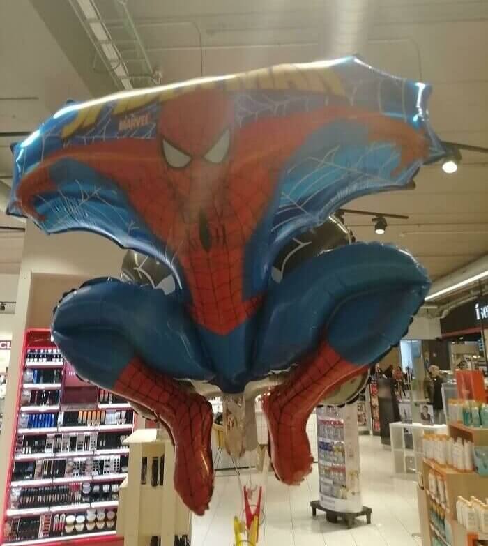
We've certainly never seen Spider-Man sitting like this, but whoever took this picture can't really say the same. Looking at this for more than a second is probably enough, especially because Spider-Man is a beloved hero, and we'd like to picture him as nothing more or less than that. The big problem here is that once you see what everyone else thinks is going on here, you can't really unsee it.
Thankfully, this balloon was made for kids, and a child probably wouldn't think that anything is wrong with the way that Spider-Man is sitting there as the adults are laughing.
A Very UnMotivational Gym Quote
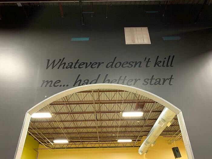
Someone's gym recently did a renovation, and the new quote that was put up on the wall doesn't seem to make much sense. This was supposed to be an inspiration, but whether it was the grammar or the punctuation, something clearly went wrong when they put the words up. We can't even figure out what this was supposed to say in the first place, so hopefully, they'll fix it at some point.
Quotes are often put up around a gym in order to motivate the people who are working out, but that just won't be able to happen at this specific one.
A Regrettable Name for a Funeral Home
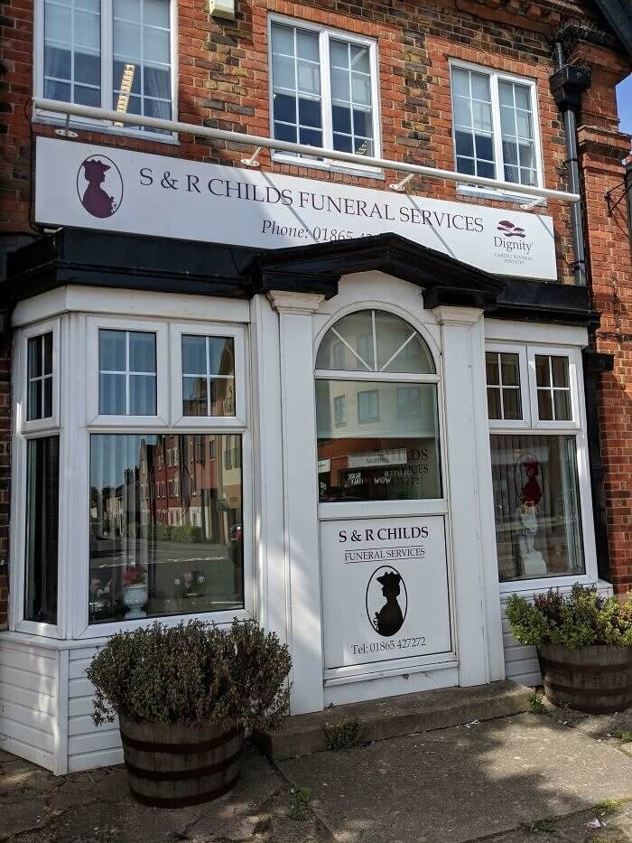
S & R Childs Funeral Services don't exclusively provide service for kids; it just seems that way because of their unfortunate name. It looks like the owners' family name here is Childs, which explains the confusion. It might not be the worst possible name for a funeral home, but there certainly are also better ones out there. There certainly are funeral homes for children, but this one doesn't happen to be one of them.
At first glance, some feelings of sadness might have flown through you if you originally thought that this was a place that specializes in funerals for children, but they don't.
This Parking Spot Is for Extremists Only
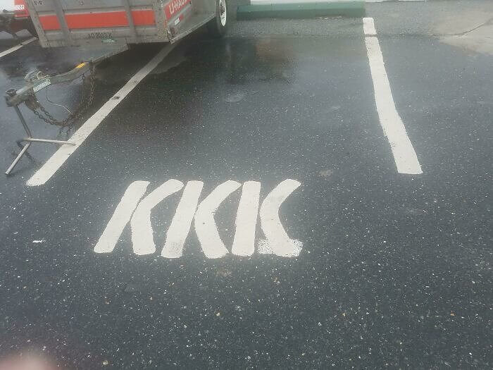
Parking spots are often abbreviated when they are labeled for specific people, but this abbreviation stands for an extremist group that probably won't be parking here. It's actually kind of hard to think of what this could possibly stand for, which is why most people will be referring to the actual KKK when seeing this. It's certainly an interesting choice of letters unless that was the real goal in the first place.
This parking spot isn't actually reserved for the KKK, although that would also probably be our first thought if we happened to randomly come across this on a day out.
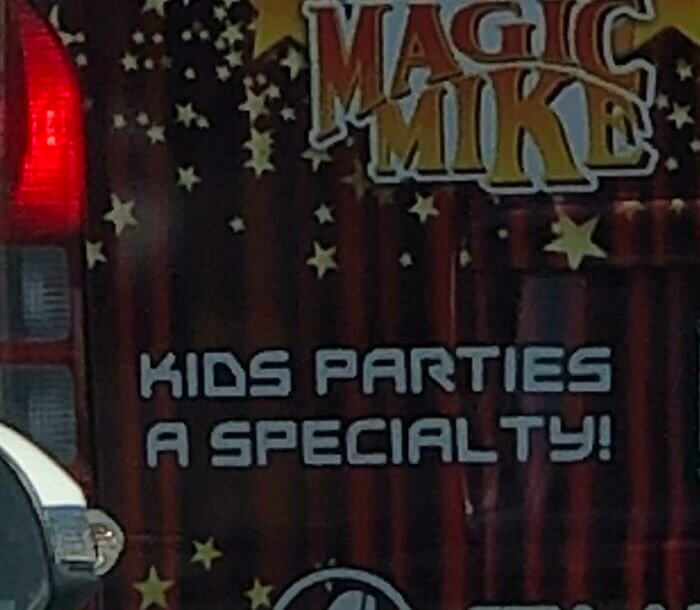
The Magical Version of Magic Mike
Magic Mike and kids' parties shouldn't really go together, but in this case, it's actually quite okay. That's because this Magic Mike is just a magician, but he probably should have chosen a different name for himself. That also would have been a smart thing to do before advertising that he specializes explicitly in parties for kids. It's probably safe to assume that this magician never actually watched the movie we're all thinking about.
If you did happen to watch the movie, then you probably know what Magic Mike is all about. Thankfully, it seems like this one is just a magician and nothing more than that.
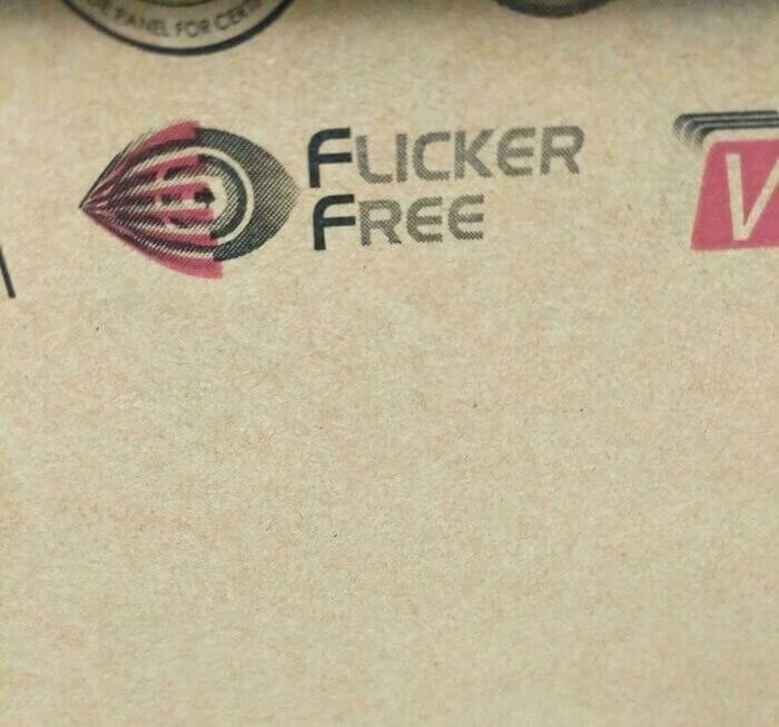
An Unfortunate Choice of Font
The font that was used to spell out 'flicker free' kind of changed the entire sentence, either for better or for worse- it depends on how you look at it. Most people appreciate a fine joke, which means this significant error is actually super funny. Choosing the right font is pretty crucial, but actually proofreading it before it's printed onto a product is probably even more important in the long run.
This illusion might have been hard to see at first. Actually, you might not have even noticed the issue here unless we took the time to point it out to you.
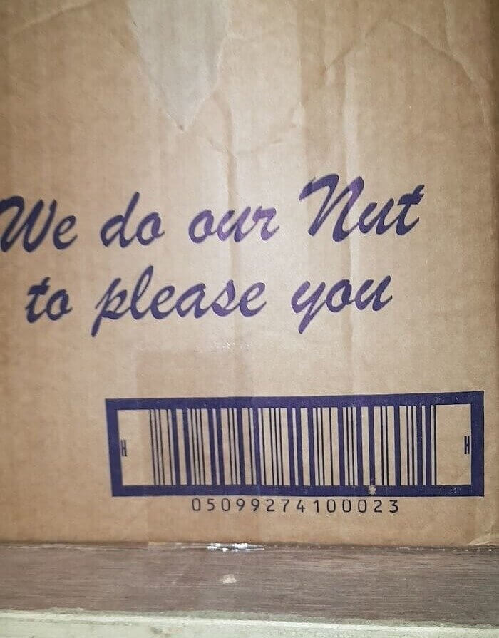
A Peanut Pun Gone Wrong
The intended phrase of this sentence might be hard to understand, but at least they tried. This peanut company was trying to come up with a phone way to use the word 'nut' in a sentence, so they ended up choosing this one. It doesn't really make any sense, and there are probably much better ways to use the word 'nut' in a phrase, but it is what it is.
This peanut brand was attempting to make some kind of joke or pun for the sake of its customers but ended up creating something that didn't really make much sense.
From White Powder to Power
The error here proves that spelling means everything since one missing word can change the meaning of a single sentence. Whichever company created this diagram specializes in electric cables and wanted to explain why there is a white powder inside of them. Someone left the letter 'd' out of 'powder,' which gave everything a whole new meaning. Of course, electric cables do actually come with white powder inside of them and not power.
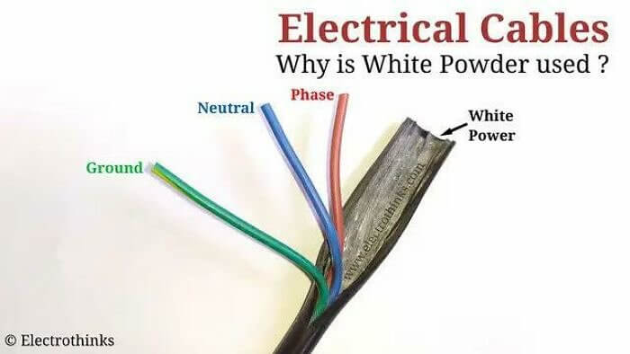
This simple diagram became more confusing after someone pointed out the minor spelling error. Even though it was a small mistake, it just happened to have changed everything about the instructions.
The Worst Possible Set of Initials
The van owner isn't afraid to call himself the B.J Guy, although he probably should be. Everyone walking past this vehicle may have to look twice at the company's name to make sense of it. For some reason, the words underneath the super strange name don't even provide a bit of clarity about what the B.J Guy actually does for a living, and of course, we'd really like to know.
There might not be a worse pair of initials out there, but these could have been fine if they weren't permanently and publicly pasted onto the side of a work van.
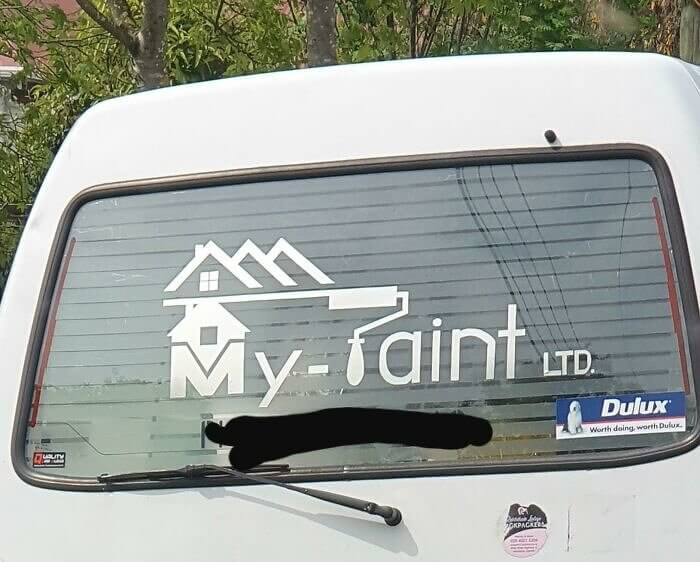
A Bad Place to Put a Paint Roller
The truth is, most people wouldn't even realize that something could be off about this company name until turning to the internet. Unless you were both the brain of a comic, in that case, you probably wouldn't even be able to realize that word is supposed to be 'paint.' The lettering style of these words are certainly unique, and this company wanted to get artsy when choosing this strange design.
The paint company that owns this van probably should have put the paint roller as the 't' instead of the 'p' in order to avoid exactly what has happened here.
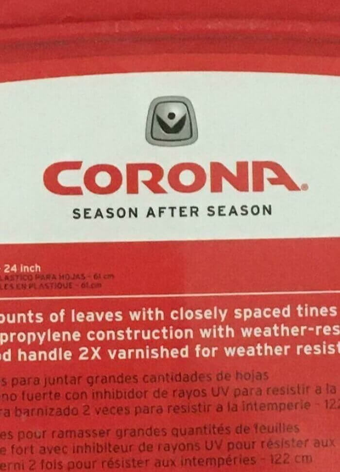
An Accurate Slogan of the Future
There's probably nothing more unfortunate than the accuracy of this slogan that belongs to a tool brand. Of course, they had no idea that corona would one day become a worldwide pandemic that never seems to disappear. Although covid didn't exist as they were coming up with this brand name, the irony today is pretty strong. The name can stay, but they should probably adjust the "season after season" part.
The thing about this logo is that it isn't necessarily a bad design; it's just way too relevant. Especially because the corona virus is still going strong, season after season.
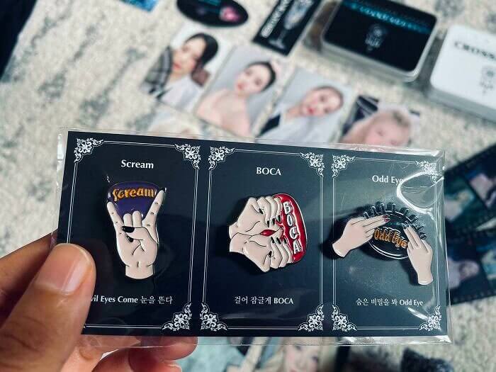
This Kpop Pin Design Looks so Wrong
The name of this Kpop group is called Dreamcatcher, and they were selling this pin as part of their merchandise, where something doesn't look quite right. Boca has something to do with Kpop, but the more you stare at their pin design- the more it starts to look like something you'd rather not see. It could be a whole number of things, but all we know is this design could be considered unfortunate.
The world of Kpop is pretty unique but also super popular. So, if you happen to understand what this pin is supposed to be, we would really like to know.
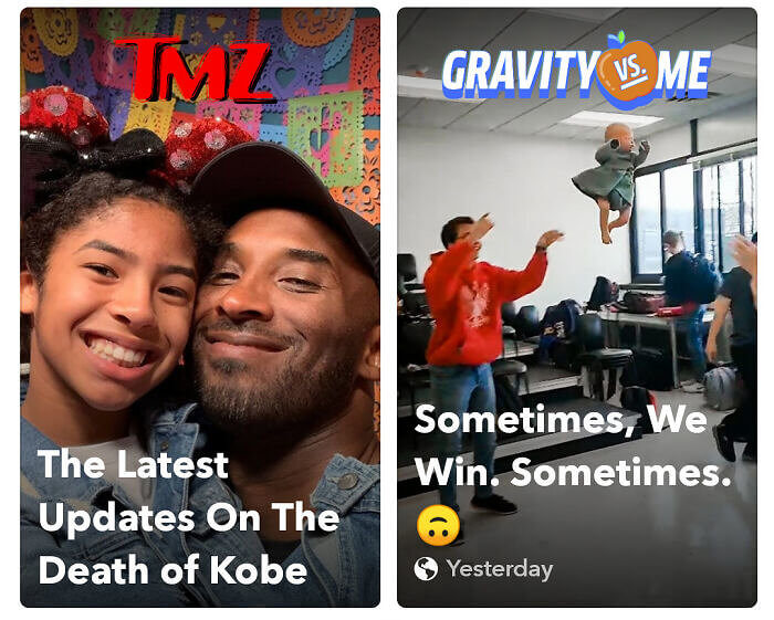
Snapchat's Unfortunate Algorithm
The way these two videos popped up next to each other was completely random but also unlucky. Of course, they have absolutely nothing to do with each other, but they're connected in the worst way possible. The universe, specifically social media, works in mysterious and random ways, while algorithms are on a different level. The person who saw this while scrolling through social media had to take a picture to show everyone else.
Unfortunately, Kobe and his daughter passed away in a helicopter accident, which is why the gravity comment in a separate video next to it created all kinds of bad connotations.
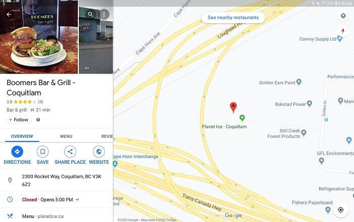
A Restaurant Name for Boomers
This interesting restaurant might be called boomers, but it's not actually made in reference to the kind you're thinking of. Whether you're generation Z or a millennial, you're more than welcome to go to this bar and grill that just happens to have a pretty unfortunate name. The name of this place doesn't actually have anything to do with a generation; it just kind of sounds like that's the case.
The funny thing about this here is that most people laughing at this restaurant name are probably boomers themselves and wouldn't mind a restaurant that was made especially for them.

